Your content goes here. Edit or remove this text inline or in the module Content settings. You can also style every aspect of this content in the module Design settings and even apply custom CSS to this text in the module Advanced settings.
A few months back Mozilla opens up an online submission for the open community for re-branding itself, so the design community comes up with lots of options but the one they selected is very cool and elegant.
Most people think Mozilla only controls the Firefox Browser but the company does a lot more than just maintaining one of the Top Web Browsers. To present the new image they wanted to re-brand themselves, and opens a community-based submission so that they can get what they want and here what they stated:
At the core of this project is the need for Mozilla’s purpose and brand to be better understood by more people. We want to be known as the champions for a healthy Internet. An Internet where we are all free to explore and discover and create and innovate without barriers or limitations. Where power is in the hands of many, not held by few. An Internet where our safety, security and identity are respected.
Today, we believe these principles matter more than ever. And as a not-for-profit organization, we’re uniquely able to build products, technologies, and programs that keep the Internet growing and healthy, with individuals informed and in control of their online lives.
Our brand identity – our logo, our voice, our design – is an important signal of what we believe in and what we do. And because we are so committed to ensuring the Internet is a healthy global public resource, open and accessible to everyone, we’ve designed the language of the Internet into our brand identity.
So what they came up with is pretty cool, as Mozilla described “Our logo with its nod to URL language reinforces that the Internet is at the heart of Mozilla. We are committed to the original intent of the link as the beginning of an unfiltered, unmediated experience into the rich content of the Internet.”

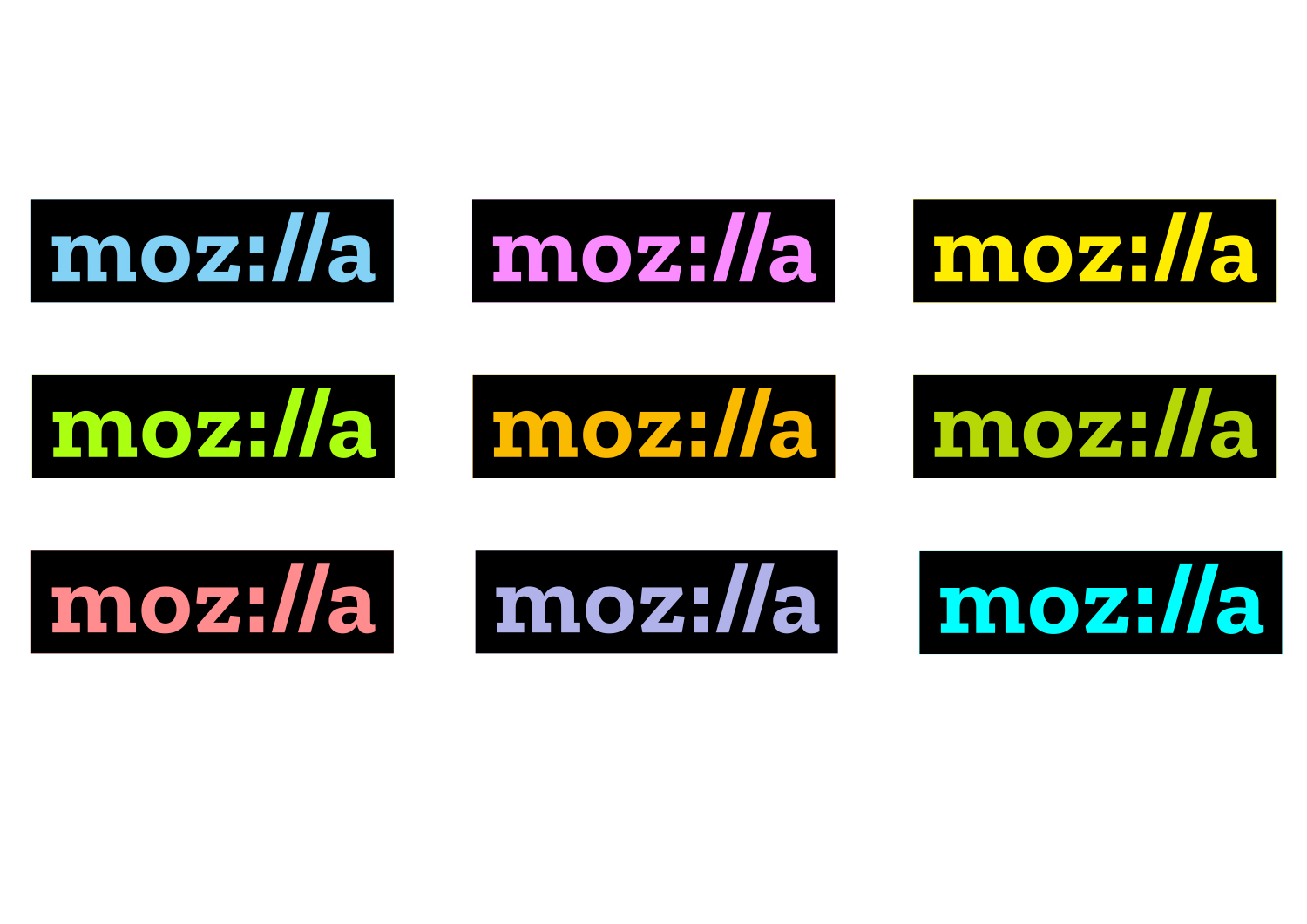
There color palette, derived from the highlight colors used by Firefox and other web browsers, distinguishes our brand from its contemporaries. Color flows into our logo and changes according to the context in which the logo is used. As we develop our style guide, we’ll define color pairings, intensities, and guidelines.

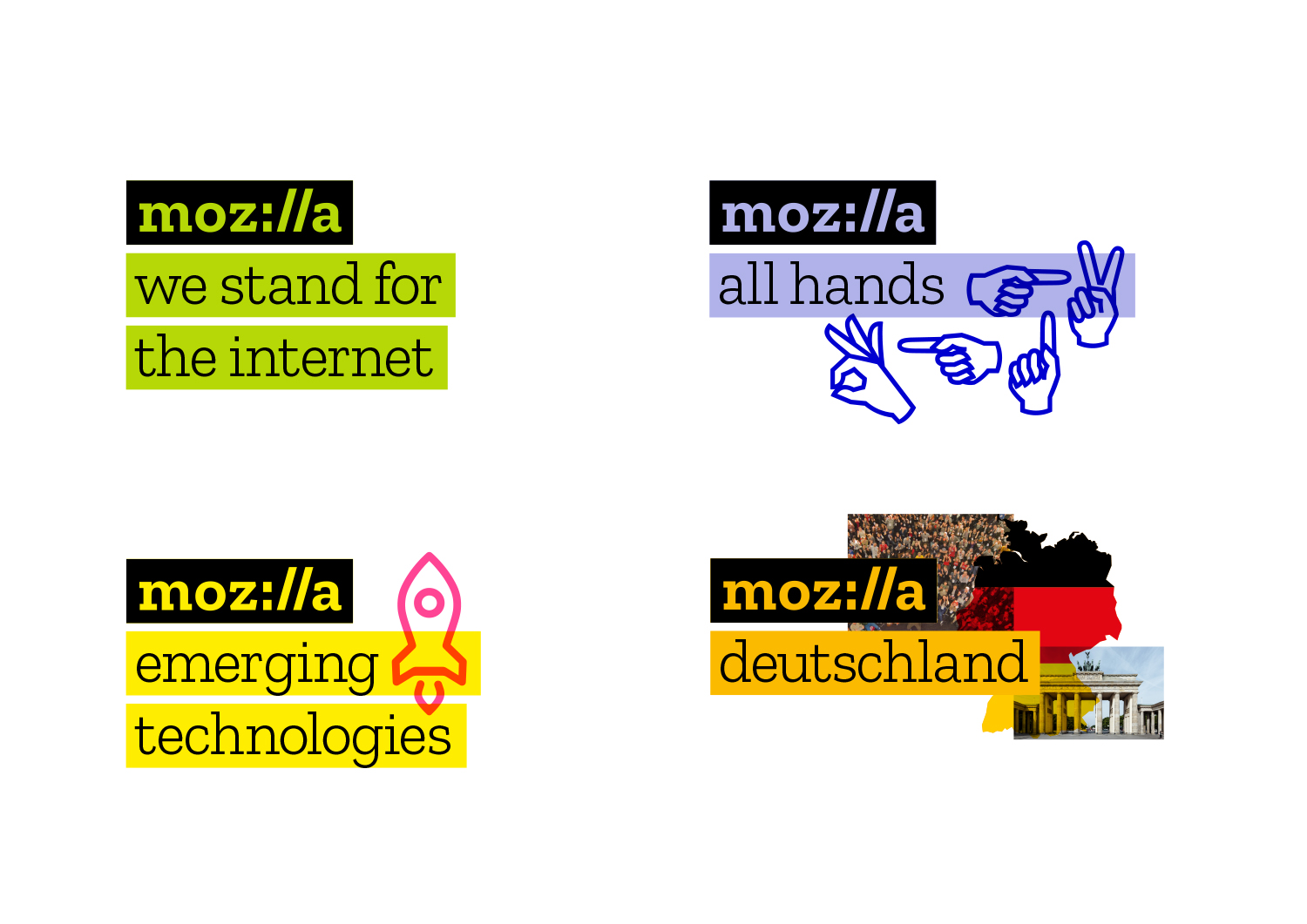
Copy lines to the right or below the logo hold core Mozilla messages. They also hold program, event, and team names — simplifying and unifying a multitude of different Mozilla activities. It will now be easier to know that something is “from” Mozilla and understand how our global initiatives connect and reinforce one another.
The system enables Mozilla volunteer communities across the globe to create their own identity by selecting the color and choosing imagery unique to them. Meanwhile, the core blocks of our system, bounding boxes, and typography will provide consistency, making it clear that these communities are part of one Mozilla.

